Concept
Buffr Fintech App
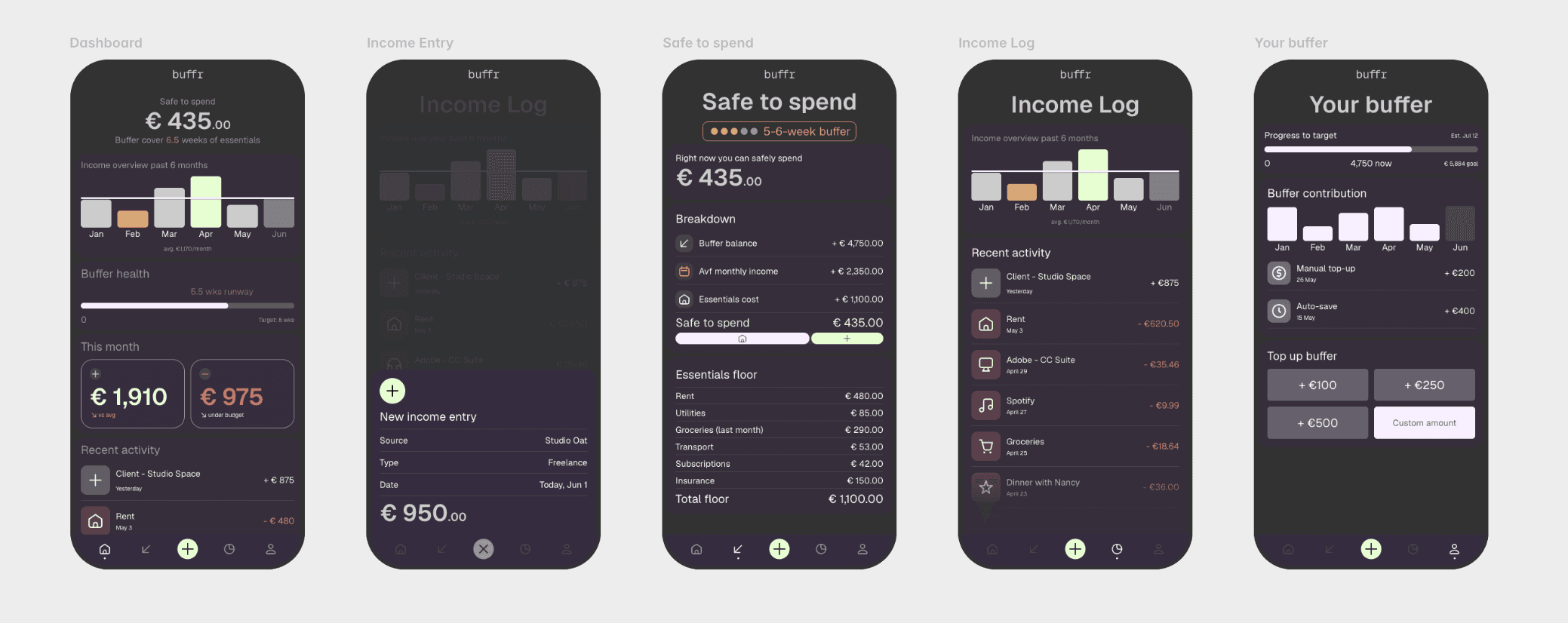
Buffr is a personal finance app concept designed for freelancers and independent workers with irregular income. The project was developed as a self-initiated portfolio case study, covering the full design process from initial problem framing through to interactive prototype. My role spanned product strategy, UX design, visual design, and prototyping. Most budgeting apps are built around a fixed monthly salary — a reality that doesn't exist for freelancers, contractors, and gig workers. When income is unpredictable, traditional budget categories break down, and users are left either overspending in good months or paralysed by guilt in lean ones. The result is financial anxiety and avoidance, not better money management. The core insight driving Buffr is a reframe of the central question. Instead of "how much can I spend this month?" — which assumes a fixed income — the right question for a variable earner is "how much is safe to spend right now?" Building the entire product around that single dynamic figure, calculated transparently from buffer balance, average income, and essential costs, became the design hypothesis the whole experience was built to test.


Before opening any design tool, I worked through the product strategy and user scenario on paper. Rough sketches established the content hierarchy and layout logic for each screen, with annotations capturing the key UX decisions at each point — what information the user needs first, what can sit below the fold, and which interactions needed to feel effortless versus deliberate.

With the layout logic established, I translated the sketches into structured wireframes to test the information architecture before committing to any visual direction. This stage focused on content relationships, navigation flow, and the core interaction patterns — particularly the income log entry form and the safe-to-spend breakdown — stripping everything back to structure and function.

Key decisions & trade-offs
Every significant design decision in Buffr involved a deliberate trade-off. Showing the safe-to-spend calculation transparently rather than abstracting it away adds cognitive load but builds the trust that makes the number meaningful. Expressing the savings buffer in weeks of runway rather than euros answers the question freelancers actually ask. The scenario slider — letting users simulate an income drop in real time — is unconventional in consumer fintech, but grounded in the insight that confronting uncertainty is more calming than avoiding it. Each decision prioritised the emotional reality of the target user over convention.

Prototype
The final prototype covers five screens: onboarding, dashboard, income log, safe-to-spend calculator, and savings buffer. The visual direction — deep navy, electric purple, amber — was chosen to position Buffr as a precision tool rather than a wellness app, reflecting a design-literate target audience who responds to something that feels built specifically for them. All screens were designed in Figma and prototyped in Framer.

Reflection
Buffr is a concept, not a shipped product, and the next meaningful step would be user testing — specifically to validate whether the "safe to spend" figure is trusted on first encounter or whether the breakdown panel needs to be more prominent earlier. I'd also explore whether the manual income entry model holds up in practice, or whether a light bank-sync option would reduce the setup friction enough to justify the added complexity.